COLOR PERCEPTION AFFECTING CONSUMER BEHAVIOR
Many marketers will already be aware that different colors have a different psychological impact on consumers. Over time, we have been hardwired to make certain neuro-associations with different colors. The impact of these influences is subtle but effective and worth implementing. A number of commonly used colors are listed below, alongside their associations within a marketing context.
Red: known internationally as a buying color. It reflects emotions such as anger, lust, and passion and is a definite attention-getter. When used in small amounts, it is the best color to stimulate sales. However, if used in large amounts, it can turn off the more subtle customers. Red is best used to draw attention to a specific message or area you want the customer to focus on.
Red logos evoked feelings of expertise and self-assurance.
Orange: known to be the most imitating of colours and the least favourite colour in the world. Direct mail marketers tend to use this on envelopes to draw attention to a product they are selling. Orange is best known as the colour for sexuality and creativity and is associated with affordability. It’s also an attention grabber, but is best used sparingly or as an accent colour.
Purples and Violets: These colours are subjective, and people will either love them or hate them. Purple is associated with spiritual healing and royalty.
Purple logos invoked perceptions of femininity, glamor and charm.
Blue: This was determined to be the best seller and people’s most favourite colour throughout the world, regardless of culture. Blue is considered the colour of communication; light blue lends to fantasy and dark blue leads to authority and power. Blue conjures up feelings of tranquillity, peacefulness and flights of fancy.
Green: This is a relaxing colour that stirs up feelings of the outdoors, forest, grass and lush meadows. It is considered a passive, not a stimulating colour.
Yellow: Is the first colour seen by the retina. This is a good focus, or attention-getting colour, and a good accent colour when used in moderation.
Yellow logos were interpreted as fun and modern.
Brown: Denotes traditional or natural values. Light shades of wood are associated with affordability; dark hued shades are associated with opulence and richness. Brown is a relaxing and casual colour, the colour of wood, the wealth and nature.
Neutrals: Black or white are always a safe and effective accent. They enhance primary colours when used as an accent, and when used exclusively, they give off an institutionalized or sterile feeling.
We can see from the above that Red and Blue are the two most prominent and internationally recognized colours to promote sales. As such, this makes a strong case for the use of each to highlight price discounts.
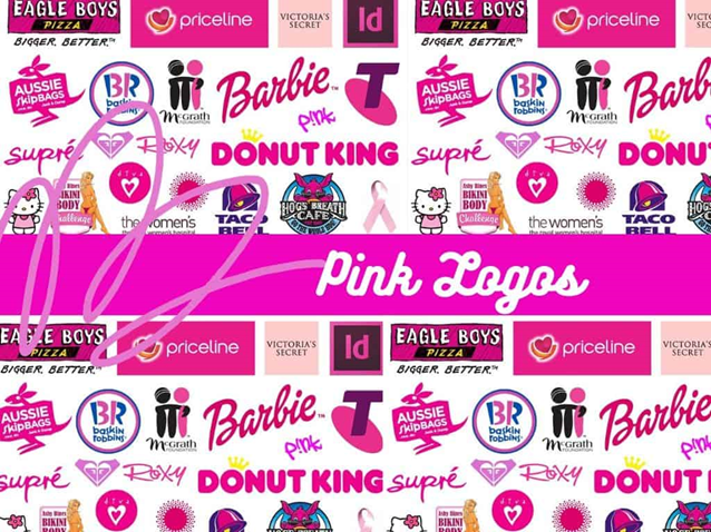
Pink: Pink logos gave the perception of youth, imagination and fashion.
EXAMPLE

The evolution of the Apple logo is a great example of how simple color and design changes can majorly change brand perception. Check out this timeline of brand transformation from 1976 to now. Apple’s initial logo was cluttered and not essentially striking. Now when consumers see an image of an apple the powerhouse technology company instantly comes to mind.
The takeaway
Before choosing a logo color for your brand, evaluate how you want to be perceived by the consumer. Color (closely followed by shape, design, numbers, and words) is the visual component of a logo that people remember most in fact, simply incorporating color increases brand recognition by 80%. Choose a color that correlates with the temperament and personality that you are trying to achieve. Be sure to incorporate all visuals into your decision and take your time to get it right. After all, “a picture is worth a thousand words.”